---
title: "Multivariate Statistics" # Title of the document as shown in the output
subtitle: "Coding, simulations, scatterplots, regressions, conditional means"
format:
html:
code-fold: false # Always show code (no hiding or collapsing)
code-tools: true # Enable copy / view tools for code blocks
code-appendix: false # Do not automatically gather code at the end, we do that directly via the parser tool
math: mathjax # forces MathJax, which is more robust with Greek letters.
execute:
echo: true # Display all code in the output
eval: true # Execute all code blocks
error: true # Show errors instead of stopping or hiding them
---
## Constructing a dataset: 3×9d8 and secondary colors {keywords="variable|observation|observations|data generating process|distribution|more than one variable|"}
::: {.callout-note}
### In The Effect
- **variable** <https://theeffectbook.net/ch-DescribingVariables.html#descriptions-of-variables>
- **observation** <https://theeffectbook.net/ch-DescribingVariables.html#summarizing-the-distribution>
- **observations** <https://theeffectbook.net/ch-DescribingVariables.html#summarizing-the-distribution>
- **data generating process** <https://theeffectbook.net/ch-Identification.html#the-data-generating-process>
- **distribution** <https://theeffectbook.net/ch-DescribingVariables.html#the-distribution>
- **more than one variable** <https://theeffectbook.net/ch-DescribingRelationships.html#conditional-conditional-means-or-controlling-for-a-variable>
:::
Imagine three sets of colored d8:
- 9 red d8
- 9 blue d8
- 9 yellow d8
For each observation:
1. Roll the 9 red d8 and record their sum as `R9d8`.
2. Roll the 9 blue d8 and record their sum as `B9d8`.
3. Roll the 9 yellow d8 and record their sum as `Y9d8`.
The variables `R9d8`, `B9d8`, and `Y9d8` are our **primary variables**.
We then construct two **secondary variables** by combining primary variables.
- `purple_9d8 = R9d8 + B9d8`
- `orange_9d8 = R9d8 + Y9d8`
```{python}
import random
import pandas as pd
import matplotlib.pyplot as plt
random.seed(989898)

def roll_9d8():

    total = 0

    for i in range(9):
        total += random.randint(1, 8)

    return total

n_observations = 150

R9d8 = []
B9d8 = []
Y9d8 = []

for i in range(n_observations):

    R9d8.append(roll_9d8())
    B9d8.append(roll_9d8())
    Y9d8.append(roll_9d8())

df_RBY_9d8 = pd.DataFrame({
    "R9d8": R9d8,
    "B9d8": B9d8,
    "Y9d8": Y9d8
})

df_RBY_9d8["purple_9d8"] = (
    df_RBY_9d8["R9d8"]
    + df_RBY_9d8["B9d8"]
)

df_RBY_9d8["orange_9d8"] = (
    df_RBY_9d8["R9d8"]
    + df_RBY_9d8["Y9d8"]
)

print(df_RBY_9d8.head())
```
The dataframe contains one observation per row and one variable per column.
## Marginal distributions
The next figure displays the distribution of each variable separately.
```{python}
fig, axes = plt.subplots(
    5,
    1,
    figsize=(6,30)
)

variables = [
    "R9d8",
    "B9d8",
    "Y9d8",
    "purple_9d8",
    "orange_9d8"
]

colornames = [
    "red",
    "blue",
    "yellow",
    "purple",
    "orange"
]

for ax, variable, colorname in zip(
    axes,
    variables,
    colornames
):

    counts = (
        df_RBY_9d8[variable]
        .value_counts()
        .sort_index()
    )

    ax.bar(
        counts.index,
        counts.values,
        color=colorname
    )

    ax.set_title(variable)
    ax.set_ylabel("Count")

plt.tight_layout()

plt.show()
plt.close()

print(df_RBY_9d8.describe())
```
## Pairwise relationships
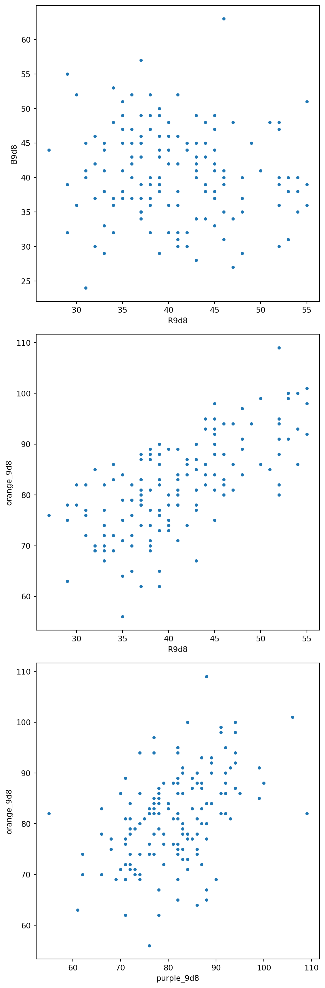
The next figure displays scatterplots for three variable pairs:
- `R9d8` and `B9d8`
- `R9d8` and `orange_9d8`
- `purple_9d8` and `orange_9d8`
```{python}
fig, axes = plt.subplots(
    3,
    1,
    figsize=(6,18)
)

axes[0].scatter(
    df_RBY_9d8["R9d8"],
    df_RBY_9d8["B9d8"],
    s=10
)

axes[0].set_xlabel("R9d8")
axes[0].set_ylabel("B9d8")

axes[1].scatter(
    df_RBY_9d8["R9d8"],
    df_RBY_9d8["orange_9d8"],
    s=10
)

axes[1].set_xlabel("R9d8")
axes[1].set_ylabel("orange_9d8")

axes[2].scatter(
    df_RBY_9d8["purple_9d8"],
    df_RBY_9d8["orange_9d8"],
    s=10
)

axes[2].set_xlabel("purple_9d8")
axes[2].set_ylabel("orange_9d8")

plt.tight_layout()

plt.show()
plt.close()
```
## The prediction metaphor {keywords="outcome variable|scatterplot|regression|line-fitting|slope|intercept|uncorrelated|"}
::: {.callout-note}
### In The Effect
- **outcome variable** <https://theeffectbook.net/ch-DrawingCausalDiagrams.html#thinking-through-the-data-generating-process>
- **scatterplot** <https://theeffectbook.net/ch-DescribingRelationships.html#what-is-a-relationship>
- **regression** <https://theeffectbook.net/ch-StatisticalAdjustment.html#the-basics-of-regression>
- **line-fitting** <https://theeffectbook.net/ch-DescribingRelationships.html#line-fitting>
- **slope** <https://theeffectbook.net/ch-DescribingRelationships.html#line-fitting>
- **intercept** <https://theeffectbook.net/ch-FixedEffects.html#regression-estimators>
- **uncorrelated** <https://theeffectbook.net/ch-StatisticalAdjustment.html#regression-assumptions-and-sampling-variation>
:::
When running regressions, our ongoing metaphor will be that we try to **predict** `orange_9d8`. This does not refer to literal prediction as in "predict the future": we have the observations of `orange_9d8` already, so we do not have to "predict" anything. We also know exactly how `orange_9d8` was constructed, and if both `R9d8` and `Y9d8` are available, "predicting" `orange_9d8` from them is trivial.
One interpretation of "predict" is out-of-sample prediction: we try to guess what the value of the hypothetical next observation would be.
The other interpretation of "predict" is metaphorical: "predict" stands for "document relationships between variables and determine how observing one variable is informative about another". Outside of simulation settings, researchers observe a dataset but do not observe the data-generating process. We place ourselves in the position of such a researcher, and represent ignorance of the data-generating process by restricting access to some variables and working with subsets of the full dataframe.
## Predicting orange_9d8 from nothing
Suppose the only available variable is:
- `orange_9d8`
All other variables are hidden.
The dataframe below contains exactly that variable.
```{python}
df_orange_only = (
    df_RBY_9d8[
        ["orange_9d8"]
    ]
)

print(df_orange_only.head())
```
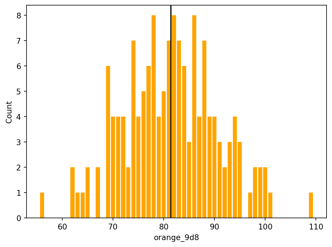
The histogram below displays the distribution of `orange_9d8`. Without access to any other variables, a natural prediction is the sample average of `orange_9d8`. The vertical line indicates the sample average.
```{python}
orange_9d8_mean = (
    df_orange_only["orange_9d8"]
    .mean()
)


orange_counts = (
    df_orange_only["orange_9d8"]
    .value_counts()
    .sort_index()
)

plt.bar(
    orange_counts.index,
    orange_counts.values,
    color="orange"
)

plt.axvline(
    orange_9d8_mean,
    color="black"
)

plt.xlabel("orange_9d8")
plt.ylabel("Count")

plt.show()
plt.close()


print("Sample mean of orange_9d8:", orange_9d8_mean)
```
## Predicting orange_9d8 from B9d8
Suppose the available variables are:
- `B9d8`
- `orange_9d8`
The remaining variables are hidden.
The dataframe below contains exactly those variables.
```{python}
df_B = (
    df_RBY_9d8[
        [
            "B9d8",
            "orange_9d8"
        ]
    ]
)

print(df_B.head())
```
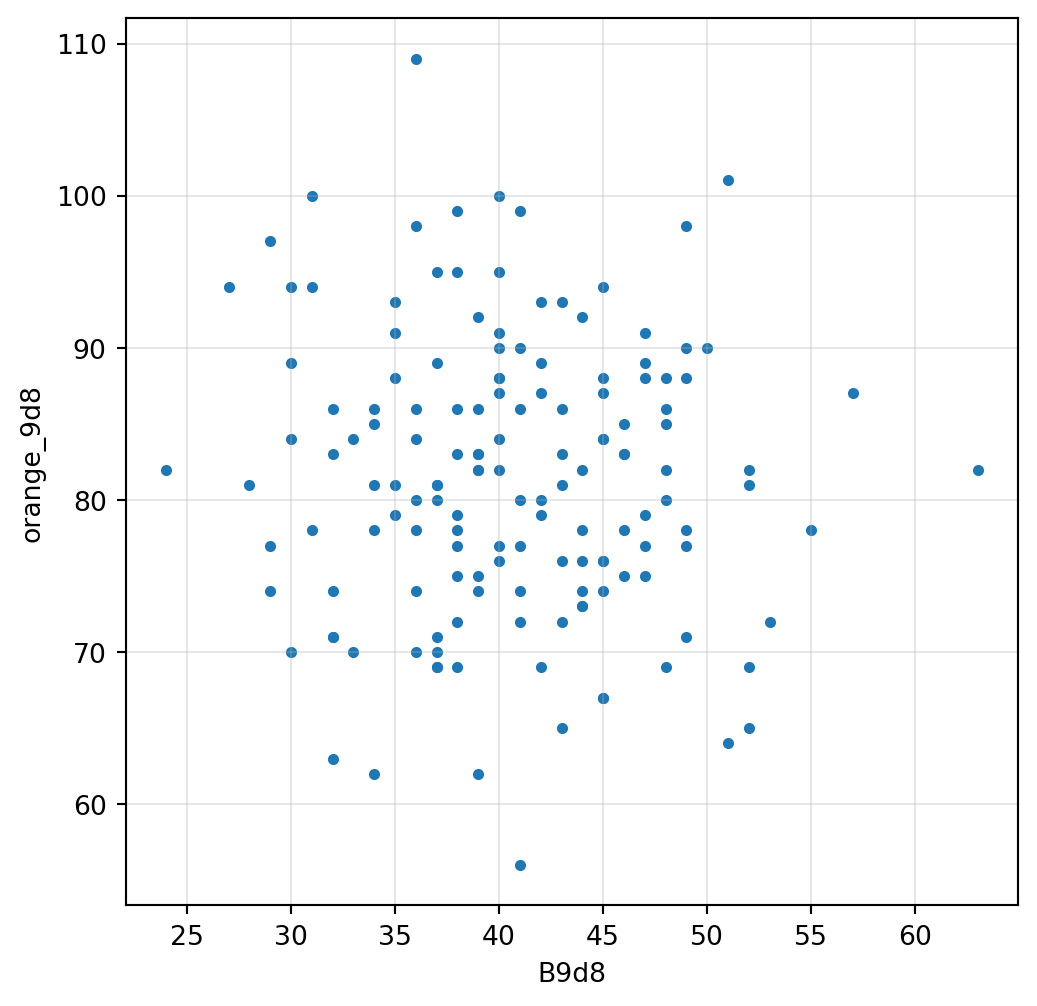
The scatterplot below displays all observed pairs of values.
```{python}
plt.figure(figsize=(6,6))

plt.scatter(
    df_B["B9d8"],
    df_B["orange_9d8"],
    s=10
)

plt.xlabel("B9d8")
plt.ylabel("orange_9d8")

plt.grid(alpha=0.3)

plt.show()
plt.close()
```
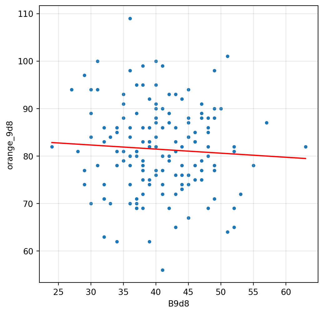
We now compute the line of best fit relating `orange_9d8` to `B9d8`. For that we load the `statsmodels.api` library
```{python}
import statsmodels.formula.api as smf

results_B = smf.ols(
    "orange_9d8 ~ B9d8",
    data=df_B
).fit()

print(results_B.summary())
```
The summary table reports:
- coefficient estimates
- standard errors
- t statistics
- confidence intervals
- R²
- additional diagnostics
The next figure displays the scatterplot together with the fitted line.
```{python}
intercept_B = (
    results_B.params["Intercept"]
)

slope_B = (
    results_B.params["B9d8"]
)

x_line_B = list(
    range(
        int(df_B["B9d8"].min()),
        int(df_B["B9d8"].max()) + 1
    )
)

y_line_B = [
    intercept_B + slope_B * x
    for x in x_line_B
]

plt.figure(figsize=(6,6))

plt.scatter(
    df_B["B9d8"],
    df_B["orange_9d8"],
    s=10
)

plt.plot(
    x_line_B,
    y_line_B,
    color="red"
)

plt.xlabel("B9d8")
plt.ylabel("orange_9d8")

plt.grid(alpha=0.3)

plt.show()
plt.close()
```
## Predicting orange_9d8 from R9d8
Suppose the available variables are:
- `R9d8`
- `orange_9d8`
The remaining variables are hidden.
The dataframe below contains exactly those variables.
```{python}
df_R = (
    df_RBY_9d8[
        [
            "R9d8",
            "orange_9d8"
        ]
    ]
)

print(df_R.head())
```
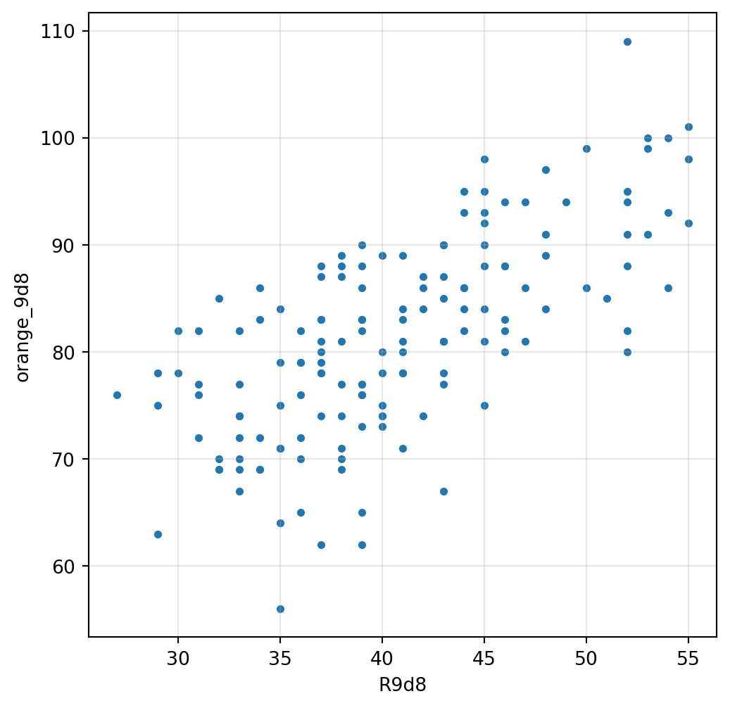
The scatterplot below displays all observed pairs of values.
```{python}
plt.figure(figsize=(6,6))

plt.scatter(
    df_R["R9d8"],
    df_R["orange_9d8"],
    s=10
)

plt.xlabel("R9d8")
plt.ylabel("orange_9d8")

plt.grid(alpha=0.3)

plt.show()
plt.close()
```
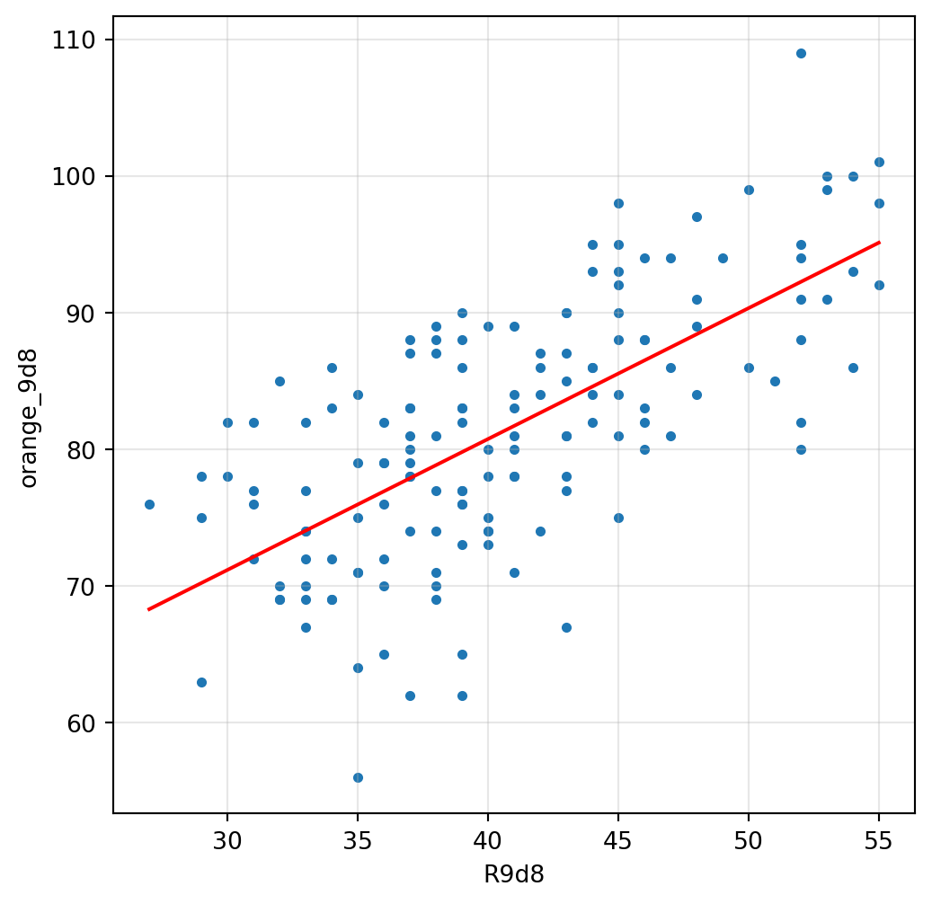
We now compute the line of best fit relating `orange_9d8` to `R9d8`.
```{python}
results_R = smf.ols(
    "orange_9d8 ~ R9d8",
    data=df_R
).fit()

print(results_R.summary())
```
The next figure displays the scatterplot together with the fitted line.
```{python}
intercept_R = (
    results_R.params["Intercept"]
)

slope_R = (
    results_R.params["R9d8"]
)

x_line_R = list(
    range(
        int(df_R["R9d8"].min()),
        int(df_R["R9d8"].max()) + 1
    )
)

y_line_R = [
    intercept_R + slope_R * x
    for x in x_line_R
]

plt.figure(figsize=(6,6))

plt.scatter(
    df_R["R9d8"],
    df_R["orange_9d8"],
    s=10
)

plt.plot(
    x_line_R,
    y_line_R,
    color="red"
)

plt.xlabel("R9d8")
plt.ylabel("orange_9d8")

plt.grid(alpha=0.3)

plt.show()
plt.close()
```
## Predicting orange_9d8 from purple_9d8
Suppose the available variables are:
- `purple_9d8`
- `orange_9d8`
The remaining variables are hidden.
The dataframe below contains exactly those variables.
```{python}
df_purple = (
    df_RBY_9d8[
        [
            "purple_9d8",
            "orange_9d8"
        ]
    ]
)

print(df_purple.head())
```
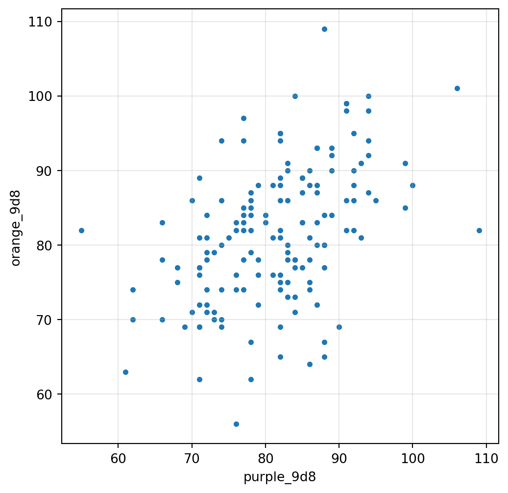
The scatterplot below displays all observed pairs of values.
```{python}
plt.figure(figsize=(6,6))

plt.scatter(
    df_purple["purple_9d8"],
    df_purple["orange_9d8"],
    s=10
)

plt.xlabel("purple_9d8")
plt.ylabel("orange_9d8")

plt.grid(alpha=0.3)

plt.show()
plt.close()
```
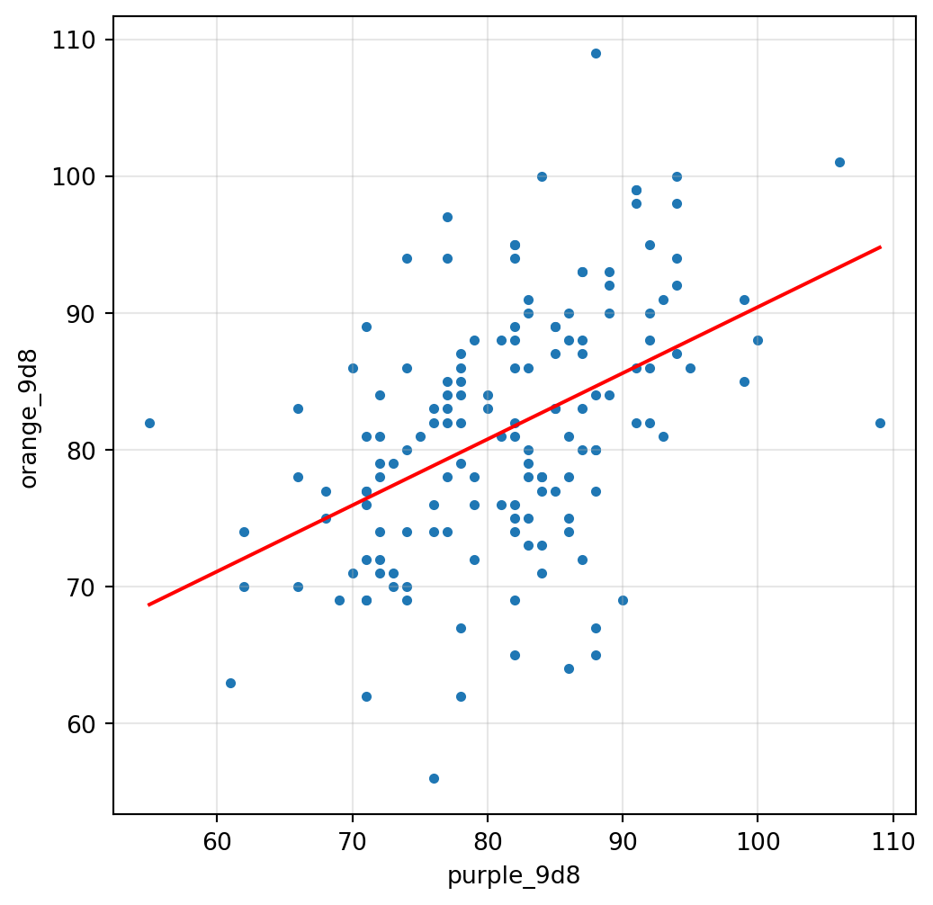
We now compute the line of best fit relating `orange_9d8` to `purple_9d8`.
```{python}
results_purple = smf.ols(
    "orange_9d8 ~ purple_9d8",
    data=df_purple
).fit()

print(results_purple.summary())
```
The next figure displays the scatterplot together with the fitted line.
```{python}
intercept_purple = (
    results_purple.params["Intercept"]
)

slope_purple = (
    results_purple.params["purple_9d8"]
)

x_line_purple = list(
    range(
        int(df_purple["purple_9d8"].min()),
        int(df_purple["purple_9d8"].max()) + 1
    )
)

y_line_purple = [
    intercept_purple + slope_purple * x
    for x in x_line_purple
]

plt.figure(figsize=(6,6))

plt.scatter(
    df_purple["purple_9d8"],
    df_purple["orange_9d8"],
    s=10
)

plt.plot(
    x_line_purple,
    y_line_purple,
    color="red"
)

plt.xlabel("purple_9d8")
plt.ylabel("orange_9d8")

plt.grid(alpha=0.3)

plt.show()
plt.close()
```
The regression summary reports the estimated relationship between `purple_9d8` and `orange_9d8`.
The regression of `orange_9d8` on `purple_9d8` will serve as the benchmark regression in the next sections.
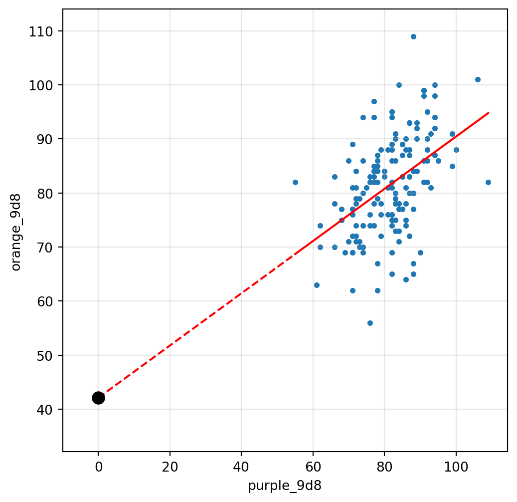
## Off-ramp: The intercept
The regression summary contains a coefficient labelled `const`.
This coefficient is the intercept of the regression line.
The intercept is the predicted value of `orange_9d8` when the predictor equals zero.
To see where this value appears on the graph, we redraw the scatterplot and force the horizontal axis to include zero.
```{python}
plt.figure(figsize=(6,6))

plt.scatter(
    df_RBY_9d8["purple_9d8"],
    df_RBY_9d8["orange_9d8"],
    s=10
)

# Solid part: observed support
plt.plot(
    x_line_purple,
    y_line_purple,
    color="red"
)

# Dashed extrapolation to the intercept
x_line_intercept = [
    0,
    x_line_purple[0]
]

y_line_intercept = [
    intercept_purple,
    intercept_purple + slope_purple * x_line_purple[0]
]

plt.plot(
    x_line_intercept,
    y_line_intercept,
    color="red",
    linestyle="--"
)

plt.scatter(
    [0],
    [intercept_purple],
    color="black",
    s=80,
    zorder=10
)

plt.xlim(left=-10)

plt.ylim(
    min(
        intercept_purple - 10,
        df_RBY_9d8["orange_9d8"].min()
    ),
    df_RBY_9d8["orange_9d8"].max() + 5
)

plt.xlabel("purple_9d8")
plt.ylabel("orange_9d8")

plt.grid(alpha=0.3)

plt.show()
plt.close()
```
The black point is located at: `(0, Intercept)`. It lies on the fitted regression line, albeit in a region of the scatterplot where there are no observations. The coefficient labelled `Intercept` therefore determines where the regression line crosses the vertical axis.
## Off-ramp: Centering the predictor
The meaning of the intercept depends on how the predictor is measured.
We now create a centered version of `purple_9d8` by subtracting its sample mean.
```{python}
purple_9d8_mean = (
    df_RBY_9d8["purple_9d8"]
    .mean()
)

print(
    "Sample mean of purple_9d8:",
    purple_9d8_mean
)

df_RBY_9d8["purple_9d8_centered"] = (
    df_RBY_9d8["purple_9d8"]
    -
    purple_9d8_mean
)

print(
    df_RBY_9d8[
        [
            "purple_9d8",
            "purple_9d8_centered"
        ]
    ].head()
)
```
The centered variable measures distance from the sample mean.
A value of:
`purple_9d8_centered = 0`
corresponds to an observation whose value of `purple_9d8` equals the sample mean.
We now rerun the regression using the centered predictor.
```{python}
results_centered = smf.ols(
    "orange_9d8 ~ purple_9d8_centered",
    data=df_RBY_9d8
).fit()
```
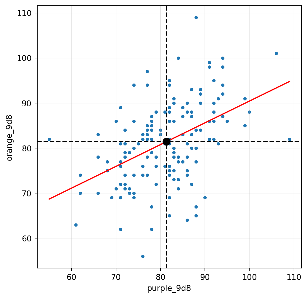
The next figure displays the data in the original `purple_9d8` scale together with the fitted line from the centered regression.
```{python}
centercept = (
    results_centered.params["Intercept"]
)

slope_centered = (
    results_centered.params[
        "purple_9d8_centered"
    ]
)

x_line_centered = list(
    range(
        int(
            df_RBY_9d8[
                "purple_9d8"
            ].min()
        ),
        int(
            df_RBY_9d8[
                "purple_9d8"
            ].max()
        ) + 1
    )
)

y_line_centered = [
    centercept
    +
    slope_centered
    *
    (
        x
        -
        purple_9d8_mean
    )
    for x in x_line_centered
]

plt.figure(figsize=(6,6))

plt.scatter(
    df_RBY_9d8["purple_9d8"],
    df_RBY_9d8["orange_9d8"],
    s=10
)

plt.plot(
    x_line_centered,
    y_line_centered,
    color="red"
)

plt.scatter(
    [purple_9d8_mean],
    [centercept],
    color="black",
    s=80,
    zorder=10
)

plt.axvline(
    purple_9d8_mean,
    color="black",
    linestyle="--"
)

plt.axhline(
    centercept,
    color="black",
    linestyle="--"
)

plt.xlabel(
    "purple_9d8"
)

plt.ylabel(
    "orange_9d8"
)

plt.grid(alpha=0.3)

plt.show()
plt.close()
```
The black point has coordinates:
`(sample mean of purple_9d8, Intercept)`
We now print the regression summary.
```{python}
print(
    results_centered.summary()
)
```
The coefficient labelled `Intercept` is the fitted value when:
`purple_9d8_centered = 0`
Since `purple_9d8_centered` was constructed by subtracting the sample mean of `purple_9d8`, the value:
`purple_9d8_centered = 0`
corresponds to:
`purple_9d8 = sample mean of purple_9d8`
For this reason, the intercept in the centered regression is sometimes informally called a "centercept".
## Fitted values, Residuals, Ordinary Least Squares {keywords="predicted|prediction|regression|line|residuals|error|ordinary least squares|sum of squared residuals|"}
::: {.callout-note}
### In The Effect
- **predicted** <https://theeffectbook.net/ch-StatisticalAdjustment.html#regression-tables-and-model-fit-statistics>
- **prediction** <https://theeffectbook.net/ch-StatisticalAdjustment.html#interaction-terms>
- **regression** <https://theeffectbook.net/ch-StatisticalAdjustment.html#the-basics-of-regression>
- **line** <https://theeffectbook.net/ch-DescribingRelationships.html#line-fitting>
- **residuals** <https://theeffectbook.net/ch-DescribingRelationships.html#line-fitting>
- **error** <https://theeffectbook.net/ch-StatisticalAdjustment.html#error-terms>
- **ordinary least squares** <https://theeffectbook.net/ch-DescribingRelationships.html#line-fitting>
- **sum of squared residuals** <https://theeffectbook.net/ch-DescribingRelationships.html#line-fitting>
:::
The fitted values are the values predicted by the regression line.
They are computed directly from the estimated intercept and slope.
```{python}
df_RBY_9d8["orange_9d8_predicted"] = (
    results_purple.fittedvalues
)

print(
    df_RBY_9d8[
        [
            "purple_9d8",
            "orange_9d8",
            "orange_9d8_predicted"
        ]
    ].head()
)
```
The table displays:
- the predictor `purple_9d8`
- the observed value `orange_9d8`
- the fitted value `orange_9d8_predicted`
The fitted values lie on the regression line.
For each observation, the residual is defined as:
`residual = observed value - fitted value`
```{python}
df_RBY_9d8["orange_9d8_residual"] = (
    df_RBY_9d8["orange_9d8"]
    -
    df_RBY_9d8["orange_9d8_predicted"]
)

print(
    df_RBY_9d8[
        [
            "orange_9d8",
            "orange_9d8_predicted",
            "orange_9d8_residual"
        ]
    ].head()
)
```
The table displays:
- the observed value
- the fitted value
- the residual
Every observation now has both a prediction and an associated prediction error.
The table displays:
- the observed value
- the fitted value
- the residual
Every observation now has both a prediction and an associated prediction error.
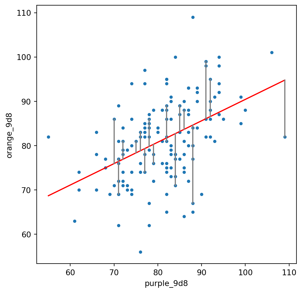
The residual for an observation is the vertical distance between the observed point and the fitted line.
The graph below displays a subset of residuals.
```{python}
plt.figure(figsize=(6,6))

plt.scatter(
    df_RBY_9d8["purple_9d8"],
    df_RBY_9d8["orange_9d8"],
    s=10
)

plt.plot(
    x_line_purple,
    y_line_purple,
    color="red"
)

for i in range(20):

    plt.plot(
        [
            df_RBY_9d8["purple_9d8"].iloc[i],
            df_RBY_9d8["purple_9d8"].iloc[i]
        ],
        [
            df_RBY_9d8["orange_9d8"].iloc[i],
            df_RBY_9d8["orange_9d8_predicted"].iloc[i]
        ],
        color="gray"
    )

plt.xlabel("purple_9d8")
plt.ylabel("orange_9d8")

plt.show()
plt.close()
```
Each gray segment corresponds to one residual.
The regression line is computed using Ordinary Least Squares (OLS).
OLS chooses the intercept and slope that minimize the sum of squared residuals.
We can compute that quantity directly from the residuals.
```{python}
SSR = (
    df_RBY_9d8["orange_9d8_residual"]**2
).sum()

print(SSR)
```
The fitted regression line is the line with the smallest possible value of the sum of squared residuals among all straight lines.
## Residuals versus fitted values {keywords="residuals|predicted|error|"}
::: {.callout-note}
### In The Effect
- **residuals** <https://theeffectbook.net/ch-DescribingRelationships.html#line-fitting>
- **predicted** <https://theeffectbook.net/ch-StatisticalAdjustment.html#regression-tables-and-model-fit-statistics>
- **error** <https://theeffectbook.net/ch-StatisticalAdjustment.html#error-terms>
:::
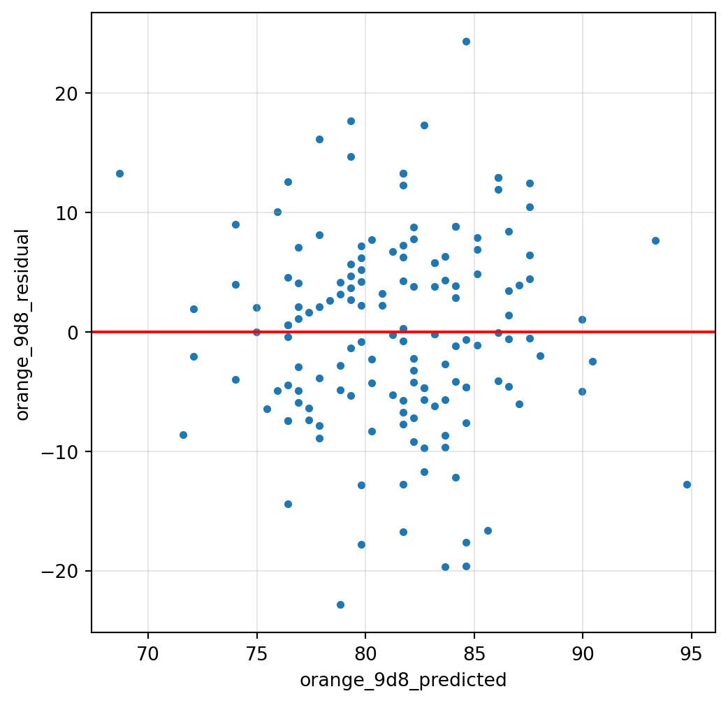
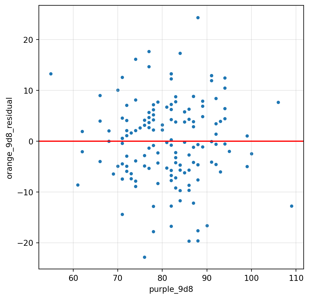
The residuals can be plotted against the fitted values produced by the regression.
The horizontal line corresponds to a residual equal to zero.
```{python}
plt.figure(figsize=(6,6))

plt.scatter(
    df_RBY_9d8["orange_9d8_predicted"],
    df_RBY_9d8["orange_9d8_residual"],
    s=10
)

plt.axhline(
    0,
    color="red"
)

plt.xlabel("orange_9d8_predicted")
plt.ylabel("orange_9d8_residual")

plt.grid(alpha=0.3)

plt.show()
plt.close()
```
Each point corresponds to one observation.
The horizontal position records the fitted value.
The vertical position records the corresponding residual.
## Residuals versus purple_9d8
The residuals can also be plotted against the predictor used in the regression.
```{python}
plt.figure(figsize=(6,6))

plt.scatter(
    df_RBY_9d8["purple_9d8"],
    df_RBY_9d8["orange_9d8_residual"],
    s=10
)

plt.axhline(
    0,
    color="red"
)

plt.xlabel("purple_9d8")
plt.ylabel("orange_9d8_residual")

plt.grid(alpha=0.3)

plt.show()
plt.close()
```
Each point corresponds to one observation.
The horizontal position records the value of `purple_9d8`.
The vertical position records the residual from the benchmark regression.
## Off-ramp: Conditional means {keywords="conditional mean|average|"}
::: {.callout-note}
### In The Effect
- **conditional mean** <https://theeffectbook.net/ch-DescribingRelationships.html#conditional-means>
- **average** <https://theeffectbook.net/ch-CausalitywithLessModeling.html#wide-open-spaces>
:::
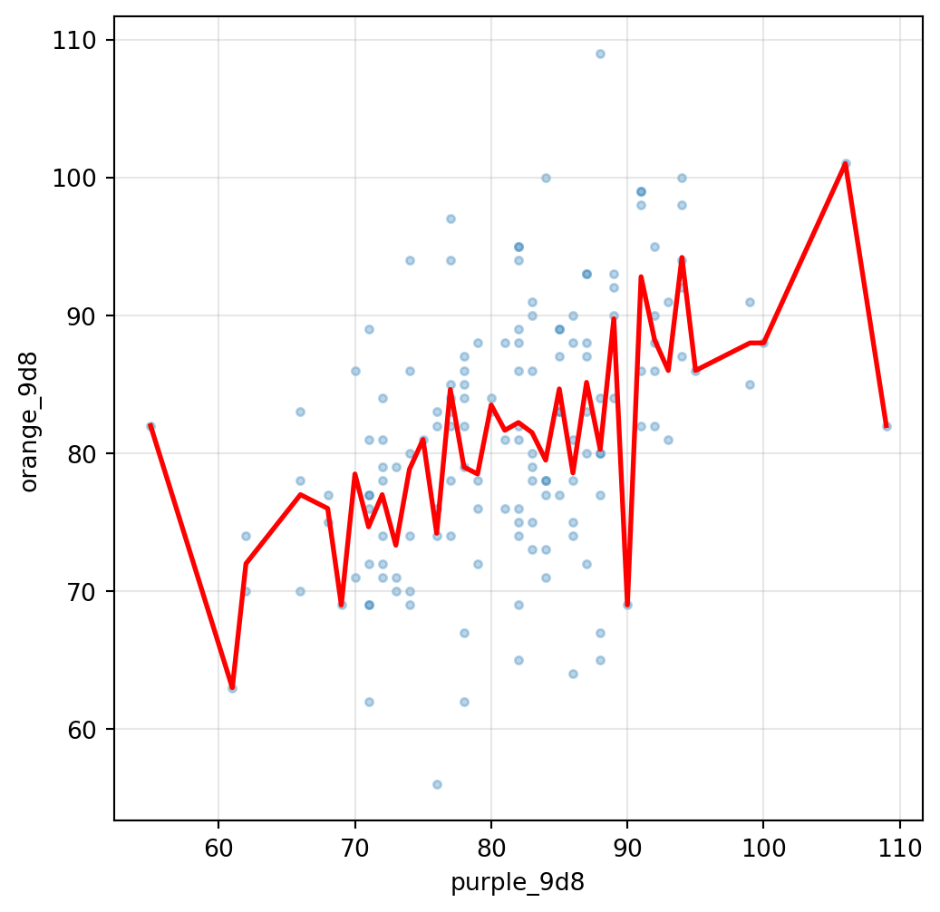
The regression line is one way of summarizing the relationship between two variables.
Another approach is to compute conditional means.
For each observed value of `purple_9d8`, we compute the average value of `orange_9d8`.
```{python}
conditional_means = (
    df_RBY_9d8
    .groupby("purple_9d8")
    ["orange_9d8"]
    .mean()
    .reset_index()
)

print(
    conditional_means.head()
)
```
The table contains:
- a value of `purple_9d8`
- the corresponding average value of `orange_9d8`
Each row summarizes a subset of observations from the dataset.
The conditional means can be added to the scatterplot.
```{python}
plt.figure(figsize=(6,6))

plt.scatter(
    df_RBY_9d8["purple_9d8"],
    df_RBY_9d8["orange_9d8"],
    s=10,
    alpha=0.3
)

plt.plot(
    conditional_means["purple_9d8"],
    conditional_means["orange_9d8"],
    color="red",
    linewidth=2
)

plt.xlabel("purple_9d8")
plt.ylabel("orange_9d8")

plt.grid(alpha=0.3)

plt.show()
plt.close()
```
The red curve joins the conditional means.
## Conditional means and regression
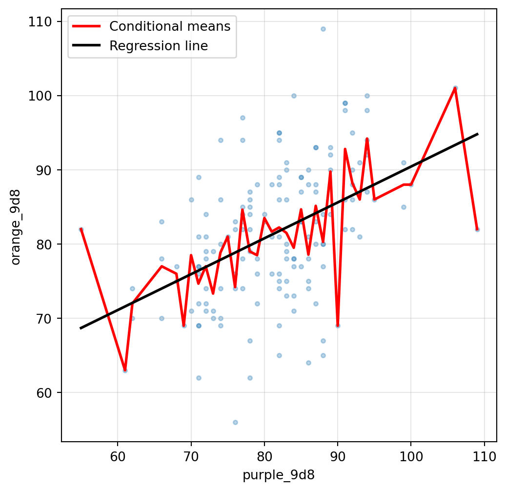
The next figure displays:
- observations
- conditional means
- regression line
```{python}
plt.figure(figsize=(6,6))

plt.scatter(
    df_RBY_9d8["purple_9d8"],
    df_RBY_9d8["orange_9d8"],
    s=10,
    alpha=0.3
)

plt.plot(
    conditional_means["purple_9d8"],
    conditional_means["orange_9d8"],
    color="red",
    linewidth=2,
    label="Conditional means"
)

plt.plot(
    x_line_purple,
    y_line_purple,
    color="black",
    linewidth=2,
    label="Regression line"
)

plt.legend()

plt.xlabel("purple_9d8")
plt.ylabel("orange_9d8")

plt.grid(alpha=0.3)

plt.show()
plt.close()
```
The conditional means and the regression line are constructed from the same pair of variables:
- `purple_9d8`
- `orange_9d8`
The conditional means use one average for each observed value of `purple_9d8`.
The regression uses a single straight line.
## Multiple predictors: setup {keywords="multiple|predictive|controlling for a variable|correlated with each other|more than one variable|"}
::: {.callout-note}
### In The Effect
- **multiple** <https://theeffectbook.net/ch-Matching.html#multiple-matching-variables>
- **predictive** <https://theeffectbook.net/ch-InstrumentalVariables.html#assumptions-for-instrumental-variables>
- **controlling for a variable** <https://theeffectbook.net/ch-DescribingRelationships.html#conditional-conditional-means-or-controlling-for-a-variable>
- **correlated with each other** <https://theeffectbook.net/ch-StatisticalAdjustment.html#why-your-standard-errors-are-probably-wrong>
- **more than one variable** <https://theeffectbook.net/ch-DescribingRelationships.html#conditional-conditional-means-or-controlling-for-a-variable>
:::
So far, we have estimated several regressions of orange_9d8 on a single variable.
We now turn to multiple regression, with more than one variable. To make comparisons easier, we will progressively build a regression results table, with only key results, for ease of comparison. However, we should not skip printing full regression summaries, so we will progressively add them to a large appendix document, to be printed as an appendix.
## Initializing the regression results table and appendix
The rows of the table correspond to quantities reported by regression summaries.
The columns correspond to different regression specifications.
A helper function adds the results from a regression to a new column.
```{python}
regression_results_table = pd.DataFrame(
    index=[
        "Intercept_coef",
        "Intercept_P>|t|",
        "",          #### Blank rows make the table more readable
        "R9d8_coef",
        "R9d8_P>|t|",
       "",
        "B9d8_coef",
        "B9d8_P>|t|",
        "",
        "purple_9d8_coef",
        "purple_9d8_P>|t|",
        "",
        "R-squared",
        "Adj. R-squared",
        "No. Observations"
    ]
)

regression_summaries = {}

def add_regression_to_table(
    table,
    column_name,
    results
):

    column = pd.Series(index=table.index, dtype=float)

    for variable in results.params.index:
        column[f"{variable}_coef"] = results.params[variable]
        column[f"{variable}_P>|t|"] = results.pvalues[variable]

    column["R-squared"] = results.rsquared
    column["Adj. R-squared"] = results.rsquared_adj
    column["No. Observations"] = results.nobs

    table[column_name] = column

    regression_summaries[column_name] = (
        results.summary()
    )
```
We begin by adding existing regression results to the table.
```{python}
add_regression_to_table(
    regression_results_table,
    "B",
    results_B
)

add_regression_to_table(
    regression_results_table,
    "R",
    results_R
)

add_regression_to_table(
    regression_results_table,
    "purple",
    results_purple
)

print(regression_results_table.round(3).fillna(""))
```
## Multiple predictors
We now add `B9d8` to the regression that previously used only `R9d8`.
```{python}
results_RB = smf.ols(
    "orange_9d8 ~ R9d8 + B9d8",
    data=df_RBY_9d8
).fit()

add_regression_to_table(
    regression_results_table,
    "RB",
    results_RB
)

print(regression_results_table.round(3).fillna(""))
```
```{python}
results_purple_R = smf.ols(
    "orange_9d8 ~ purple_9d8 + R9d8",
    data=df_RBY_9d8
).fit()

add_regression_to_table(
    regression_results_table,
    "purple R",
    results_purple_R
)

print(regression_results_table.round(3).fillna(""))
```
```{python}
results_purple_B = smf.ols(
    "orange_9d8 ~ purple_9d8 + B9d8",
    data=df_RBY_9d8
).fit()


add_regression_to_table(
    regression_results_table,
    "purple B",
    results_purple_B
)

print(regression_results_table.round(3).fillna(""))
```
The table provides a compact summary of the regressions estimated so far.
The complete regression summaries are gathered as an appendix. There is sometimes important information contained in them (see later section on multicollinearity).
```{python}
for column_name, regression_summary in regression_summaries.items():
    print(f"Regression summary for column {column_name}:")
    print(regression_summary)
    print(f"\n\n")
```
## Complement: Correlation and covariance {keywords="correlation|covariance|"}
::: {.callout-note}
### In The Effect
- **correlation** <https://theeffectbook.net/ch-DescribingRelationships.html#line-fitting>
- **covariance** <https://theeffectbook.net/ch-DescribingRelationships.html#line-fitting>
:::
Correlation and covariance provide numerical summaries of pairwise relationships between variables. They can be computed automatically by pandas dataframe:
```{python}
covariance_matrix = (
    df_RBY_9d8[
        [
            "R9d8",
            "B9d8",
            "purple_9d8",
            "orange_9d8"
        ]
    ]
    .cov()
)

print(covariance_matrix)
```
The covariance matrix contains one covariance value for each pair of variables. Covariance depends on the scale of measurement, so covariance values are often more difficult to compare across variables.
```{python}
correlation_matrix = (
    df_RBY_9d8[
        [
            "R9d8",
            "B9d8",
            "purple_9d8",
            "orange_9d8"
        ]
    ]
    .corr()
)

print(correlation_matrix)
```
The correlation is a normalization of covariance. Correlation coefficients lie between -1 and 1. A value close to 0 indicates a weak relationship, e.g. 2 independent variables should have a correlation near 0 in a large sample.
A correlation near 1 indicates a strong positive linear relationship, and a variable is always perfectly correlated with itself (corr(X,X)=1). A -1 indicates a strong negative linear relationship (corr(X,-X)=-1)
## Comparing regression, covariance and correlation
All three tools capture some notion of co-movement between variables.
For example, in `orange_9d8 ~ purple_9d8`, the slope coefficient is positive because larger values of `purple_9d8` tend to be associated with larger values of `orange_9d8`. Likewise, the covariance and correlation between `purple_9d8` and `orange_9d8` are positive. All three statistics therefore point in the same direction. However, important differences remain.
Correlation and covariance are symmetric: for any two variables X and Y, `cov(X,Y) = cov(Y,X)` and `corr(X,Y) = corr(Y,X)`
Regression is different. The regression: `orange_9d8 ~ purple_9d8` is fundamentally not the same as: `purple_9d8 ~ orange_9d8`. The two regressions typically produce different slope coefficients (and their product need not equal 1 either).
One of the most important limitations of correlation is that it only studies pairwise relationships. Consider `B9d8` and `orange_9d8`. The variables were generated independently, so a near-zero correlation is the correct description of their pairwise relationship. However, in `orange_9d8 ~ purple_9d8 + B9d8`, the coefficient on `B9d8` was informative and the regression results changed relative to `orange_9d8 ~ purple_9d8` without `B9d8`. The fact that 'corr(B9d8, orange_9d8)' is approximately zero does not imply that `B9d8` contains no relevant information!
## Warning: Perfect multicollinearity {keywords="perfect multicollinearity|collinearity|omitted variables|"}
::: {.callout-note}
### In The Effect
- **perfect multicollinearity** <https://theeffectbook.net/ch-StatisticalAdjustment.html#collinearity>
- **collinearity** <https://theeffectbook.net/ch-StatisticalAdjustment.html#collinearity>
- **omitted variables** <https://theeffectbook.net/ch-PartialIdentification.html#resolving-back-doors-with-partial-identification-in-regression>
:::
Consider the regression using:
- `purple_9d8`
- `R9d8`
- `B9d8`
to predict:
- `orange_9d8`
```{python}
results_collinear = smf.ols(
    "orange_9d8 ~ purple_9d8 + R9d8 + B9d8",
    data=df_RBY_9d8
).fit()

print(results_collinear.summary())
```
The last line in the summary "[2] The smallest eigenvalue is `a very small number`. This might indicate that there are
strong multicollinearity problems or that the design matrix is singular." is the only warning we get.
The problem is that `purple_9d8 = R9d8 + B9d8`, so there is perfect multicollinearity: there is no unique vector of coefficients minimizing the sum of squared residuals, so strictly speaking the OLS estimate is not well-defined. Arguably, `sm.OLS.fit()` should not even return a result in this situation. Other stats packages e.g. Stata would inform the user that there is a problem and would automatically drop one variable from the regression. You can read more in econometrics textbooks about why multicollinearity is an issue, but for now let's just take this as a cautionary lesson about trusting results without inspecting the summary.
## Repeated sampling under a true null hypothesis {keywords="data generating process|p-value|significance|false positives|simulation|"}
::: {.callout-note}
### In The Effect
- **data generating process** <https://theeffectbook.net/ch-Identification.html#the-data-generating-process>
- **p-value** <https://theeffectbook.net/ch-StatisticalAdjustment.html#hypothesis-testing-in-ols>
- **significance** <https://theeffectbook.net/ch-StatisticalAdjustment.html#regression-tables-and-model-fit-statistics>
- **false positives** <https://theeffectbook.net/ch-ResearchQuestions.html#why-start-with-a-question>
- **simulation** <https://theeffectbook.net/ch-Simulation.html#simulation-with-existing-data-the-bootstrap>
:::
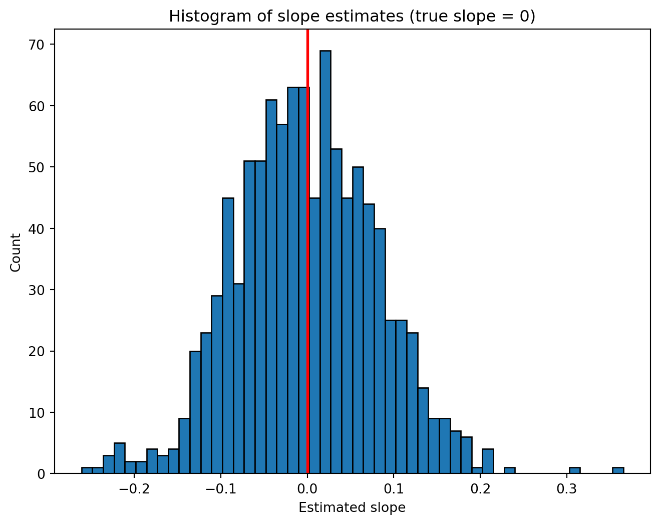
We now investigate what happens when a regression coefficient is truly zero in the data generating process, but the researcher does not know that.
The data-generating process is:
orange_9d8 = R9d8 + Y9d8
The variable B9d8 is generated independently from R9d8 and Y9d8 and therefore has no effect on orange_9d8. Its true population coefficient is exactly zero.
Nevertheless, every sample is different. Sampling variation produces different coefficient estimates, t statistics, p-values, and confidence intervals. So it is possible, purely through randomness, for an estimated regression to feature a significant coefficient on B9d8. We can observe this via simulation.
```{python}
n_replications = 1000
n_observations = 150
significance_threshold=0.05

slope_estimates = []
p_values = []
t_statistics = []
confidence_interval_lower_bounds = []
confidence_interval_upper_bounds = []

for replication in range(n_replications):

    R9d8 = []
    B9d8 = []
    Y9d8 = []

    for i in range(n_observations):

        R9d8.append(roll_9d8())
        B9d8.append(roll_9d8())
        Y9d8.append(roll_9d8())

    df_sim = pd.DataFrame({
        "R9d8": R9d8,
        "B9d8": B9d8,
        "Y9d8": Y9d8
    })

    df_sim["orange_9d8"] = (
        df_sim["R9d8"]
        +
        df_sim["Y9d8"]
    )

    results = smf.ols(
        "orange_9d8 ~ B9d8 + R9d8",
        data=df_sim
    ).fit()

    slope_estimates.append(
        results.params["B9d8"]
    )

    p_values.append(
        results.pvalues["B9d8"]
    )

    t_statistics.append(
        results.tvalues["B9d8"]
    )

    confidence_interval = (
        results.conf_int().loc["B9d8"]
    )

    confidence_interval_lower_bounds.append(
        confidence_interval[0]
    )

    confidence_interval_upper_bounds.append(
        confidence_interval[1]
    )
```
## Distribution of coefficient estimates
The histogram below shows the sampling distribution of the estimated B9d8 coefficient.
```{python}
plt.figure(figsize=(8,6))

plt.hist(
    slope_estimates,
    bins=50,
    edgecolor="black"
)

plt.axvline(
    0,
    color="red",
    linewidth=2
)

plt.xlabel("Estimated slope")
plt.ylabel("Count")

plt.title(
    "Histogram of slope estimates (true slope = 0)"
)

plt.show()
plt.close()
```
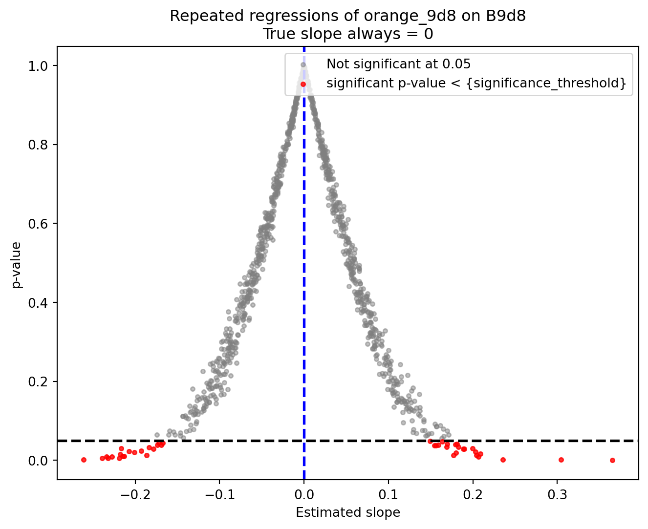
Alternatively, we can use a scatterplot to visualize the estimates and their p-values.
```{python}
significant_slopes = []
significant_pvalues = []

nonsignificant_slopes = []
nonsignificant_pvalues = []

for slope, pvalue in zip(
    slope_estimates,
    p_values
):

    if pvalue < significance_threshold:

        significant_slopes.append(
            slope
        )

        significant_pvalues.append(
            pvalue
        )

    else:

        nonsignificant_slopes.append(
            slope
        )

        nonsignificant_pvalues.append(
            pvalue
        )

plt.figure(figsize=(8,6))

plt.scatter(
    nonsignificant_slopes,
    nonsignificant_pvalues,
    color="gray",
    alpha=0.5,
    s=10,
    label=f"Not significant at {significance_threshold}"
)

plt.scatter(
    significant_slopes,
    significant_pvalues,
    color="red",
    alpha=0.8,
    s=10,
    label="significant p-value < {significance_threshold}"
)

plt.axhline(
    significance_threshold,
    color="black",
    linestyle="--",
    linewidth=2
)

plt.axvline(
    0,
    color="blue",
    linestyle="--",
    linewidth=2
)

plt.xlabel("Estimated slope")
plt.ylabel("p-value")

plt.title(
    "Repeated regressions of orange_9d8 on B9d8\nTrue slope always = 0"
)

plt.legend(loc="upper right")

plt.show()
plt.close()
```
All red points correspond to statistically significant estimates even though the true coefficient is zero in the data generating process.
A 0.05 significance threshold for rejecting the null hypothesis of coefficient=0 means that around 5% of the time, the regression will produce a significant estimate purely due to random chance.
We can compute the frequency of such "false significance" events:
```{python}
n_significant = 0

for pvalue in p_values:

    if pvalue < significance_threshold:

        n_significant += 1

false_significant_rate = (
    n_significant
    /
    len(p_values)
)

print(
    "Fraction significant:",
    round(false_significant_rate, 4)
)
```
The observed fraction should be close to `significance_threshold` when `n_replications` is high.
## Confidence intervals under a true null hypothesis
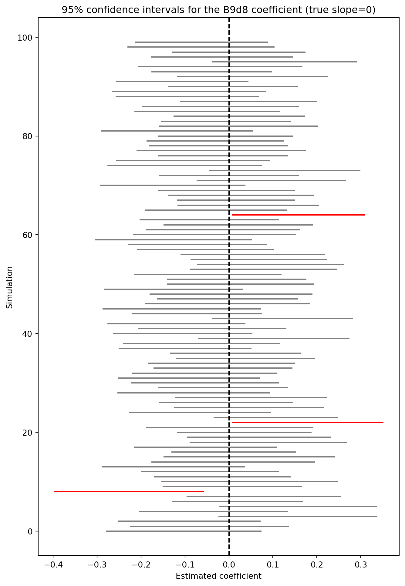
Here is a plot of the first 100 confidence intervals for the coefficient on `B9d8`. Intervals that fail to include zero correspond to statistically significant results.
```{python}
n_intervals_to_plot = 100

plt.figure(figsize=(8,12))

for interval_index in range(
    n_intervals_to_plot
):

    lower_bound = (
        confidence_interval_lower_bounds[
            interval_index
        ]
    )

    upper_bound = (
        confidence_interval_upper_bounds[
            interval_index
        ]
    )

    excludes_zero = (
        lower_bound > 0
        or
        upper_bound < 0
    )

    if excludes_zero:

        color = "red"

    else:

        color = "gray"

    plt.plot(
        [lower_bound, upper_bound],
        [interval_index, interval_index],
        color=color
    )

plt.axvline(
    0,
    color="black",
    linestyle="--"
)

plt.xlabel(
    "Estimated coefficient"
)

plt.ylabel(
    "Simulation"
)

plt.title(
    "95% confidence intervals for the B9d8 coefficient (true slope=0)"
)

plt.show()
plt.close()
```
The red intervals exclude zero and therefore correspond to statistically significant estimates. The gray intervals contain zero and therefore do not lead to rejecting the null hypothesis.
## Full script (all code blocks stacked)
```python
#%% Constructing a dataset 39d8 and secondary colors

## Imagine three sets of colored d8:
## - 9 red d8
## - 9 blue d8
## - 9 yellow d8

## For each observation:

## 1. Roll the 9 red d8 and record their sum as `R9d8`.
## 2. Roll the 9 blue d8 and record their sum as `B9d8`.
## 3. Roll the 9 yellow d8 and record their sum as `Y9d8`.

## The variables `R9d8`, `B9d8`, and `Y9d8` are our **primary variables**.

## We then construct two **secondary variables** by combining primary
## variables.

## - `purple_9d8 = R9d8 + B9d8`
## - `orange_9d8 = R9d8 + Y9d8`


import random
import pandas as pd
import matplotlib.pyplot as plt
random.seed(989898)

def roll_9d8():

    total = 0

    for i in range(9):
        total += random.randint(1, 8)

    return total

n_observations = 150

R9d8 = []
B9d8 = []
Y9d8 = []

for i in range(n_observations):

    R9d8.append(roll_9d8())
    B9d8.append(roll_9d8())
    Y9d8.append(roll_9d8())

df_RBY_9d8 = pd.DataFrame({
    "R9d8": R9d8,
    "B9d8": B9d8,
    "Y9d8": Y9d8
})

df_RBY_9d8["purple_9d8"] = (
    df_RBY_9d8["R9d8"]
    + df_RBY_9d8["B9d8"]
)

df_RBY_9d8["orange_9d8"] = (
    df_RBY_9d8["R9d8"]
    + df_RBY_9d8["Y9d8"]
)

print(df_RBY_9d8.head())


## The dataframe contains one observation per row and one variable per
## column.

#%% Marginal distributions

## The next figure displays the distribution of each variable separately.


fig, axes = plt.subplots(
    5,
    1,
    figsize=(6,30)
)

variables = [
    "R9d8",
    "B9d8",
    "Y9d8",
    "purple_9d8",
    "orange_9d8"
]

colornames = [
    "red",
    "blue",
    "yellow",
    "purple",
    "orange"
]

for ax, variable, colorname in zip(
    axes,
    variables,
    colornames
):

    counts = (
        df_RBY_9d8[variable]
        .value_counts()
        .sort_index()
    )

    ax.bar(
        counts.index,
        counts.values,
        color=colorname
    )

    ax.set_title(variable)
    ax.set_ylabel("Count")

plt.tight_layout()

plt.show()
plt.close()

print(df_RBY_9d8.describe())


#%% Pairwise relationships

## The next figure displays scatterplots for three variable pairs:

## - `R9d8` and `B9d8`
## - `R9d8` and `orange_9d8`
## - `purple_9d8` and `orange_9d8`

fig, axes = plt.subplots(
    3,
    1,
    figsize=(6,18)
)

axes[0].scatter(
    df_RBY_9d8["R9d8"],
    df_RBY_9d8["B9d8"],
    s=10
)

axes[0].set_xlabel("R9d8")
axes[0].set_ylabel("B9d8")

axes[1].scatter(
    df_RBY_9d8["R9d8"],
    df_RBY_9d8["orange_9d8"],
    s=10
)

axes[1].set_xlabel("R9d8")
axes[1].set_ylabel("orange_9d8")

axes[2].scatter(
    df_RBY_9d8["purple_9d8"],
    df_RBY_9d8["orange_9d8"],
    s=10
)

axes[2].set_xlabel("purple_9d8")
axes[2].set_ylabel("orange_9d8")

plt.tight_layout()

plt.show()
plt.close()


#%% The prediction metaphor

## When running regressions, our ongoing metaphor will be that we try to
## **predict** `orange_9d8`. This does not refer to literal prediction as
## in "predict the future": we have the observations of `orange_9d8`
## already, so we do not have to "predict" anything. We also know exactly
## how `orange_9d8` was constructed, and if both `R9d8` and `Y9d8` are
## available, "predicting" `orange_9d8` from them is trivial.

## One interpretation of "predict" is out-of-sample prediction: we try to
## guess what the value of the hypothetical next observation would be.

## The other interpretation of "predict" is metaphorical: "predict" stands
## for "document relationships between variables and determine how
## observing one variable is informative about another". Outside of
## simulation settings, researchers observe a dataset but do not observe
## the data-generating process. We place ourselves in the position of such
## a researcher, and represent ignorance of the data-generating process by
## restricting access to some variables and working with subsets of the
## full dataframe.

#%% Predicting orange9d8 from nothing

## Suppose the only available variable is:

## - `orange_9d8`

## All other variables are hidden.

## The dataframe below contains exactly that variable.

df_orange_only = (
    df_RBY_9d8[
        ["orange_9d8"]
    ]
)

print(df_orange_only.head())


## The histogram below displays the distribution of `orange_9d8`. Without
## access to any other variables, a natural prediction is the sample
## average of `orange_9d8`. The vertical line indicates the sample average.


orange_9d8_mean = (
    df_orange_only["orange_9d8"]
    .mean()
)


orange_counts = (
    df_orange_only["orange_9d8"]
    .value_counts()
    .sort_index()
)

plt.bar(
    orange_counts.index,
    orange_counts.values,
    color="orange"
)

plt.axvline(
    orange_9d8_mean,
    color="black"
)

plt.xlabel("orange_9d8")
plt.ylabel("Count")

plt.show()
plt.close()


print("Sample mean of orange_9d8:", orange_9d8_mean)


#%% Predicting orange9d8 from B9d8

## Suppose the available variables are:

## - `B9d8`
## - `orange_9d8`

## The remaining variables are hidden.

## The dataframe below contains exactly those variables.

df_B = (
    df_RBY_9d8[
        [
            "B9d8",
            "orange_9d8"
        ]
    ]
)

print(df_B.head())


## The scatterplot below displays all observed pairs of values.

plt.figure(figsize=(6,6))

plt.scatter(
    df_B["B9d8"],
    df_B["orange_9d8"],
    s=10
)

plt.xlabel("B9d8")
plt.ylabel("orange_9d8")

plt.grid(alpha=0.3)

plt.show()
plt.close()


## We now compute the line of best fit relating `orange_9d8` to `B9d8`. For
## that we load the `statsmodels.api` library

import statsmodels.formula.api as smf

results_B = smf.ols(
    "orange_9d8 ~ B9d8",
    data=df_B
).fit()

print(results_B.summary())


## The summary table reports:

## - coefficient estimates
## - standard errors
## - t statistics
## - confidence intervals
## - R²
## - additional diagnostics

## The next figure displays the scatterplot together with the fitted line.

intercept_B = (
    results_B.params["Intercept"]
)

slope_B = (
    results_B.params["B9d8"]
)

x_line_B = list(
    range(
        int(df_B["B9d8"].min()),
        int(df_B["B9d8"].max()) + 1
    )
)

y_line_B = [
    intercept_B + slope_B * x
    for x in x_line_B
]

plt.figure(figsize=(6,6))

plt.scatter(
    df_B["B9d8"],
    df_B["orange_9d8"],
    s=10
)

plt.plot(
    x_line_B,
    y_line_B,
    color="red"
)

plt.xlabel("B9d8")
plt.ylabel("orange_9d8")

plt.grid(alpha=0.3)

plt.show()
plt.close()


#%% Predicting orange9d8 from R9d8

## Suppose the available variables are:

## - `R9d8`
## - `orange_9d8`

## The remaining variables are hidden.

## The dataframe below contains exactly those variables.

df_R = (
    df_RBY_9d8[
        [
            "R9d8",
            "orange_9d8"
        ]
    ]
)

print(df_R.head())


## The scatterplot below displays all observed pairs of values.

plt.figure(figsize=(6,6))

plt.scatter(
    df_R["R9d8"],
    df_R["orange_9d8"],
    s=10
)

plt.xlabel("R9d8")
plt.ylabel("orange_9d8")

plt.grid(alpha=0.3)

plt.show()
plt.close()


## We now compute the line of best fit relating `orange_9d8` to `R9d8`.

results_R = smf.ols(
    "orange_9d8 ~ R9d8",
    data=df_R
).fit()

print(results_R.summary())


## The next figure displays the scatterplot together with the fitted line.

intercept_R = (
    results_R.params["Intercept"]
)

slope_R = (
    results_R.params["R9d8"]
)

x_line_R = list(
    range(
        int(df_R["R9d8"].min()),
        int(df_R["R9d8"].max()) + 1
    )
)

y_line_R = [
    intercept_R + slope_R * x
    for x in x_line_R
]

plt.figure(figsize=(6,6))

plt.scatter(
    df_R["R9d8"],
    df_R["orange_9d8"],
    s=10
)

plt.plot(
    x_line_R,
    y_line_R,
    color="red"
)

plt.xlabel("R9d8")
plt.ylabel("orange_9d8")

plt.grid(alpha=0.3)

plt.show()
plt.close()


#%% Predicting orange9d8 from purple9d8

## Suppose the available variables are:

## - `purple_9d8`
## - `orange_9d8`

## The remaining variables are hidden.

## The dataframe below contains exactly those variables.

df_purple = (
    df_RBY_9d8[
        [
            "purple_9d8",
            "orange_9d8"
        ]
    ]
)

print(df_purple.head())


## The scatterplot below displays all observed pairs of values.

plt.figure(figsize=(6,6))

plt.scatter(
    df_purple["purple_9d8"],
    df_purple["orange_9d8"],
    s=10
)

plt.xlabel("purple_9d8")
plt.ylabel("orange_9d8")

plt.grid(alpha=0.3)

plt.show()
plt.close()


## We now compute the line of best fit relating `orange_9d8` to
## `purple_9d8`.

results_purple = smf.ols(
    "orange_9d8 ~ purple_9d8",
    data=df_purple
).fit()

print(results_purple.summary())


## The next figure displays the scatterplot together with the fitted line.

intercept_purple = (
    results_purple.params["Intercept"]
)

slope_purple = (
    results_purple.params["purple_9d8"]
)

x_line_purple = list(
    range(
        int(df_purple["purple_9d8"].min()),
        int(df_purple["purple_9d8"].max()) + 1
    )
)

y_line_purple = [
    intercept_purple + slope_purple * x
    for x in x_line_purple
]

plt.figure(figsize=(6,6))

plt.scatter(
    df_purple["purple_9d8"],
    df_purple["orange_9d8"],
    s=10
)

plt.plot(
    x_line_purple,
    y_line_purple,
    color="red"
)

plt.xlabel("purple_9d8")
plt.ylabel("orange_9d8")

plt.grid(alpha=0.3)

plt.show()
plt.close()


## The regression summary reports the estimated relationship between
## `purple_9d8` and `orange_9d8`.

## The regression of `orange_9d8` on `purple_9d8` will serve as the
## benchmark regression in the next sections.

#%% Offramp The intercept

## The regression summary contains a coefficient labelled `const`.

## This coefficient is the intercept of the regression line.

## The intercept is the predicted value of `orange_9d8` when the predictor
## equals zero.

## To see where this value appears on the graph, we redraw the scatterplot
## and force the horizontal axis to include zero.

plt.figure(figsize=(6,6))

plt.scatter(
    df_RBY_9d8["purple_9d8"],
    df_RBY_9d8["orange_9d8"],
    s=10
)

# Solid part: observed support
plt.plot(
    x_line_purple,
    y_line_purple,
    color="red"
)

# Dashed extrapolation to the intercept
x_line_intercept = [
    0,
    x_line_purple[0]
]

y_line_intercept = [
    intercept_purple,
    intercept_purple + slope_purple * x_line_purple[0]
]

plt.plot(
    x_line_intercept,
    y_line_intercept,
    color="red",
    linestyle="--"
)

plt.scatter(
    [0],
    [intercept_purple],
    color="black",
    s=80,
    zorder=10
)

plt.xlim(left=-10)

plt.ylim(
    min(
        intercept_purple - 10,
        df_RBY_9d8["orange_9d8"].min()
    ),
    df_RBY_9d8["orange_9d8"].max() + 5
)

plt.xlabel("purple_9d8")
plt.ylabel("orange_9d8")

plt.grid(alpha=0.3)

plt.show()
plt.close()


## The black point is located at: `(0, Intercept)`. It lies on the fitted
## regression line, albeit in a region of the scatterplot where there are
## no observations. The coefficient labelled `Intercept` therefore
## determines where the regression line crosses the vertical axis.

#%% Offramp Centering the predictor

## The meaning of the intercept depends on how the predictor is measured.

## We now create a centered version of `purple_9d8` by subtracting its
## sample mean.

purple_9d8_mean = (
    df_RBY_9d8["purple_9d8"]
    .mean()
)

print(
    "Sample mean of purple_9d8:",
    purple_9d8_mean
)

df_RBY_9d8["purple_9d8_centered"] = (
    df_RBY_9d8["purple_9d8"]
    -
    purple_9d8_mean
)

print(
    df_RBY_9d8[
        [
            "purple_9d8",
            "purple_9d8_centered"
        ]
    ].head()
)


## The centered variable measures distance from the sample mean.

## A value of:

## `purple_9d8_centered = 0`

## corresponds to an observation whose value of `purple_9d8` equals the
## sample mean.

## We now rerun the regression using the centered predictor.

results_centered = smf.ols(
    "orange_9d8 ~ purple_9d8_centered",
    data=df_RBY_9d8
).fit()


## The next figure displays the data in the original `purple_9d8` scale
## together with the fitted line from the centered regression.

centercept = (
    results_centered.params["Intercept"]
)

slope_centered = (
    results_centered.params[
        "purple_9d8_centered"
    ]
)

x_line_centered = list(
    range(
        int(
            df_RBY_9d8[
                "purple_9d8"
            ].min()
        ),
        int(
            df_RBY_9d8[
                "purple_9d8"
            ].max()
        ) + 1
    )
)

y_line_centered = [
    centercept
    +
    slope_centered
    *
    (
        x
        -
        purple_9d8_mean
    )
    for x in x_line_centered
]

plt.figure(figsize=(6,6))

plt.scatter(
    df_RBY_9d8["purple_9d8"],
    df_RBY_9d8["orange_9d8"],
    s=10
)

plt.plot(
    x_line_centered,
    y_line_centered,
    color="red"
)

plt.scatter(
    [purple_9d8_mean],
    [centercept],
    color="black",
    s=80,
    zorder=10
)

plt.axvline(
    purple_9d8_mean,
    color="black",
    linestyle="--"
)

plt.axhline(
    centercept,
    color="black",
    linestyle="--"
)

plt.xlabel(
    "purple_9d8"
)

plt.ylabel(
    "orange_9d8"
)

plt.grid(alpha=0.3)

plt.show()
plt.close()


## The black point has coordinates:

## `(sample mean of purple_9d8, Intercept)`

## We now print the regression summary.

print(
    results_centered.summary()
)


## The coefficient labelled `Intercept` is the fitted value when:

## `purple_9d8_centered = 0`

## Since `purple_9d8_centered` was constructed by subtracting the sample
## mean of `purple_9d8`, the value:

## `purple_9d8_centered = 0`

## corresponds to:

## `purple_9d8 = sample mean of purple_9d8`

## For this reason, the intercept in the centered regression is sometimes
## informally called a "centercept".


#%% Fitted values Residuals Ordinary Least Squares

## The fitted values are the values predicted by the regression line.

## They are computed directly from the estimated intercept and slope.

df_RBY_9d8["orange_9d8_predicted"] = (
    results_purple.fittedvalues
)

print(
    df_RBY_9d8[
        [
            "purple_9d8",
            "orange_9d8",
            "orange_9d8_predicted"
        ]
    ].head()
)


## The table displays:

## - the predictor `purple_9d8`
## - the observed value `orange_9d8`
## - the fitted value `orange_9d8_predicted`

## The fitted values lie on the regression line.

## For each observation, the residual is defined as:

## `residual = observed value - fitted value`

df_RBY_9d8["orange_9d8_residual"] = (
    df_RBY_9d8["orange_9d8"]
    -
    df_RBY_9d8["orange_9d8_predicted"]
)

print(
    df_RBY_9d8[
        [
            "orange_9d8",
            "orange_9d8_predicted",
            "orange_9d8_residual"
        ]
    ].head()
)


## The table displays:

## - the observed value
## - the fitted value
## - the residual

## Every observation now has both a prediction and an associated prediction
## error.
## The table displays:

## - the observed value
## - the fitted value
## - the residual

## Every observation now has both a prediction and an associated prediction
## error.

## The residual for an observation is the vertical distance between the
## observed point and the fitted line.

## The graph below displays a subset of residuals.

plt.figure(figsize=(6,6))

plt.scatter(
    df_RBY_9d8["purple_9d8"],
    df_RBY_9d8["orange_9d8"],
    s=10
)

plt.plot(
    x_line_purple,
    y_line_purple,
    color="red"
)

for i in range(20):

    plt.plot(
        [
            df_RBY_9d8["purple_9d8"].iloc[i],
            df_RBY_9d8["purple_9d8"].iloc[i]
        ],
        [
            df_RBY_9d8["orange_9d8"].iloc[i],
            df_RBY_9d8["orange_9d8_predicted"].iloc[i]
        ],
        color="gray"
    )

plt.xlabel("purple_9d8")
plt.ylabel("orange_9d8")

plt.show()
plt.close()


## Each gray segment corresponds to one residual.

## The regression line is computed using Ordinary Least Squares (OLS).

## OLS chooses the intercept and slope that minimize the sum of squared
## residuals.

## We can compute that quantity directly from the residuals.

SSR = (
    df_RBY_9d8["orange_9d8_residual"]**2
).sum()

print(SSR)


## The fitted regression line is the line with the smallest possible value
## of the sum of squared residuals among all straight lines.

#%% Residuals versus fitted values

## The residuals can be plotted against the fitted values produced by the
## regression.

## The horizontal line corresponds to a residual equal to zero.

plt.figure(figsize=(6,6))

plt.scatter(
    df_RBY_9d8["orange_9d8_predicted"],
    df_RBY_9d8["orange_9d8_residual"],
    s=10
)

plt.axhline(
    0,
    color="red"
)

plt.xlabel("orange_9d8_predicted")
plt.ylabel("orange_9d8_residual")

plt.grid(alpha=0.3)

plt.show()
plt.close()


## Each point corresponds to one observation.

## The horizontal position records the fitted value.

## The vertical position records the corresponding residual.


#%% Residuals versus purple9d8

## The residuals can also be plotted against the predictor used in the
## regression.

plt.figure(figsize=(6,6))

plt.scatter(
    df_RBY_9d8["purple_9d8"],
    df_RBY_9d8["orange_9d8_residual"],
    s=10
)

plt.axhline(
    0,
    color="red"
)

plt.xlabel("purple_9d8")
plt.ylabel("orange_9d8_residual")

plt.grid(alpha=0.3)

plt.show()
plt.close()


## Each point corresponds to one observation.

## The horizontal position records the value of `purple_9d8`.

## The vertical position records the residual from the benchmark
## regression.


#%% Offramp Conditional means

## The regression line is one way of summarizing the relationship between
## two variables.

## Another approach is to compute conditional means.

## For each observed value of `purple_9d8`, we compute the average value of
## `orange_9d8`.

conditional_means = (
    df_RBY_9d8
    .groupby("purple_9d8")
    ["orange_9d8"]
    .mean()
    .reset_index()
)

print(
    conditional_means.head()
)


## The table contains:

## - a value of `purple_9d8`
## - the corresponding average value of `orange_9d8`

## Each row summarizes a subset of observations from the dataset.

## The conditional means can be added to the scatterplot.

plt.figure(figsize=(6,6))

plt.scatter(
    df_RBY_9d8["purple_9d8"],
    df_RBY_9d8["orange_9d8"],
    s=10,
    alpha=0.3
)

plt.plot(
    conditional_means["purple_9d8"],
    conditional_means["orange_9d8"],
    color="red",
    linewidth=2
)

plt.xlabel("purple_9d8")
plt.ylabel("orange_9d8")

plt.grid(alpha=0.3)

plt.show()
plt.close()


## The red curve joins the conditional means.

#%% Conditional means and regression

## The next figure displays:

## - observations
## - conditional means
## - regression line

plt.figure(figsize=(6,6))

plt.scatter(
    df_RBY_9d8["purple_9d8"],
    df_RBY_9d8["orange_9d8"],
    s=10,
    alpha=0.3
)

plt.plot(
    conditional_means["purple_9d8"],
    conditional_means["orange_9d8"],
    color="red",
    linewidth=2,
    label="Conditional means"
)

plt.plot(
    x_line_purple,
    y_line_purple,
    color="black",
    linewidth=2,
    label="Regression line"
)

plt.legend()

plt.xlabel("purple_9d8")
plt.ylabel("orange_9d8")

plt.grid(alpha=0.3)

plt.show()
plt.close()


## The conditional means and the regression line are constructed from the
## same pair of variables:

## - `purple_9d8`
## - `orange_9d8`

## The conditional means use one average for each observed value of
## `purple_9d8`.

## The regression uses a single straight line.

#%% Multiple predictors setup

## So far, we have estimated several regressions of orange_9d8 on a single
## variable.
## We now turn to multiple regression, with more than one variable. To make
## comparisons easier, we will progressively build a regression results
## table, with only key results, for ease of comparison. However, we should
## not skip printing full regression summaries, so we will progressively
## add them to a large appendix document, to be printed as an appendix.

#%% Initializing the regression results table and appendix

## The rows of the table correspond to quantities reported by regression
## summaries.
## The columns correspond to different regression specifications.
## A helper function adds the results from a regression to a new column.

regression_results_table = pd.DataFrame(
    index=[
        "Intercept_coef",
        "Intercept_P>|t|",
        "",          #### Blank rows make the table more readable
        "R9d8_coef",
        "R9d8_P>|t|",
       "",
        "B9d8_coef",
        "B9d8_P>|t|",
        "",
        "purple_9d8_coef",
        "purple_9d8_P>|t|",
        "",
        "R-squared",
        "Adj. R-squared",
        "No. Observations"
    ]
)

regression_summaries = {}

def add_regression_to_table(
    table,
    column_name,
    results
):

    column = pd.Series(index=table.index, dtype=float)

    for variable in results.params.index:
        column[f"{variable}_coef"] = results.params[variable]
        column[f"{variable}_P>|t|"] = results.pvalues[variable]

    column["R-squared"] = results.rsquared
    column["Adj. R-squared"] = results.rsquared_adj
    column["No. Observations"] = results.nobs

    table[column_name] = column

    regression_summaries[column_name] = (
        results.summary()
    )


## We begin by adding existing regression results to the table.


add_regression_to_table(
    regression_results_table,
    "B",
    results_B
)

add_regression_to_table(
    regression_results_table,
    "R",
    results_R
)

add_regression_to_table(
    regression_results_table,
    "purple",
    results_purple
)

print(regression_results_table.round(3).fillna(""))


#%% Multiple predictors

## We now add `B9d8` to the regression that previously used only `R9d8`.

results_RB = smf.ols(
    "orange_9d8 ~ R9d8 + B9d8",
    data=df_RBY_9d8
).fit()

add_regression_to_table(
    regression_results_table,
    "RB",
    results_RB
)

print(regression_results_table.round(3).fillna(""))


results_purple_R = smf.ols(
    "orange_9d8 ~ purple_9d8 + R9d8",
    data=df_RBY_9d8
).fit()

add_regression_to_table(
    regression_results_table,
    "purple R",
    results_purple_R
)

print(regression_results_table.round(3).fillna(""))


results_purple_B = smf.ols(
    "orange_9d8 ~ purple_9d8 + B9d8",
    data=df_RBY_9d8
).fit()


add_regression_to_table(
    regression_results_table,
    "purple B",
    results_purple_B
)

print(regression_results_table.round(3).fillna(""))


## The table provides a compact summary of the regressions estimated so
## far.

## The complete regression summaries are gathered as an appendix. There is
## sometimes important information contained in them (see later section on
## multicollinearity).
for column_name, regression_summary in regression_summaries.items():
    print(f"Regression summary for column {column_name}:")
    print(regression_summary)
    print(f"\n\n")


#%% Complement Correlation and covariance
## Correlation and covariance provide numerical summaries of pairwise
## relationships between variables. They can be computed automatically by
## pandas dataframe:

covariance_matrix = (
    df_RBY_9d8[
        [
            "R9d8",
            "B9d8",
            "purple_9d8",
            "orange_9d8"
        ]
    ]
    .cov()
)

print(covariance_matrix)


## The covariance matrix contains one covariance value for each pair of
## variables. Covariance depends on the scale of measurement, so covariance
## values are often more difficult to compare across variables.

correlation_matrix = (
    df_RBY_9d8[
        [
            "R9d8",
            "B9d8",
            "purple_9d8",
            "orange_9d8"
        ]
    ]
    .corr()
)

print(correlation_matrix)


## The correlation is a normalization of covariance. Correlation
## coefficients lie between -1 and 1. A value close to 0 indicates a weak
## relationship, e.g. 2 independent variables should have a correlation
## near 0 in a large sample.
## A correlation near 1 indicates a strong positive linear relationship,
## and a variable is always perfectly correlated with itself (corr(X,X)=1).
## A -1 indicates a strong negative linear relationship (corr(X,-X)=-1)

#%% Comparing regression covariance and correlation

## All three tools capture some notion of co-movement between variables.
## For example, in `orange_9d8 ~ purple_9d8`, the slope coefficient is
## positive because larger values of `purple_9d8` tend to be associated
## with larger values of `orange_9d8`. Likewise, the covariance and
## correlation between `purple_9d8` and `orange_9d8` are positive. All
## three statistics therefore point in the same direction. However,
## important differences remain.

## Correlation and covariance are symmetric: for any two variables X and Y,
## `cov(X,Y) = cov(Y,X)` and `corr(X,Y) = corr(Y,X)`
## Regression is different. The regression: `orange_9d8 ~ purple_9d8` is
## fundamentally not the same as: `purple_9d8 ~ orange_9d8`. The two
## regressions typically produce different slope coefficients (and their
## product need not equal 1 either).

## One of the most important limitations of correlation is that it only
## studies pairwise relationships. Consider `B9d8` and `orange_9d8`. The
## variables were generated independently, so a near-zero correlation is
## the correct description of their pairwise relationship. However, in
## `orange_9d8 ~ purple_9d8 + B9d8`, the coefficient on `B9d8` was
## informative and the regression results changed relative to `orange_9d8 ~
## purple_9d8` without `B9d8`. The fact that 'corr(B9d8, orange_9d8)' is
## approximately zero does not imply that `B9d8` contains no relevant
## information!

#%% Warning Perfect multicollinearity

## Consider the regression using:

## - `purple_9d8`
## - `R9d8`
## - `B9d8`

## to predict:

## - `orange_9d8`

results_collinear = smf.ols(
    "orange_9d8 ~ purple_9d8 + R9d8 + B9d8",
    data=df_RBY_9d8
).fit()

print(results_collinear.summary())


## The last line in the summary "[2] The smallest eigenvalue is `a very
## small number`. This might indicate that there are
## strong multicollinearity problems or that the design matrix is
## singular." is the only warning we get.

## The problem is that `purple_9d8 = R9d8 + B9d8`, so there is perfect
## multicollinearity: there is no unique vector of coefficients minimizing
## the sum of squared residuals, so strictly speaking the OLS estimate is
## not well-defined. Arguably, `sm.OLS.fit()` should not even return a
## result in this situation. Other stats packages e.g. Stata would inform
## the user that there is a problem and would automatically drop one
## variable from the regression. You can read more in econometrics
## textbooks about why multicollinearity is an issue, but for now let's
## just take this as a cautionary lesson about trusting results without
## inspecting the summary.

#%% Repeated sampling under a true null hypothesis

## We now investigate what happens when a regression coefficient is truly
## zero in the data generating process, but the researcher does not know
## that.

## The data-generating process is:

## orange_9d8 = R9d8 + Y9d8

## The variable B9d8 is generated independently from R9d8 and Y9d8 and
## therefore has no effect on orange_9d8. Its true population coefficient
## is exactly zero.

## Nevertheless, every sample is different. Sampling variation produces
## different coefficient estimates, t statistics, p-values, and confidence
## intervals. So it is possible, purely through randomness, for an
## estimated regression to feature a significant coefficient on B9d8. We
## can observe this via simulation.

n_replications = 1000
n_observations = 150
significance_threshold=0.05

slope_estimates = []
p_values = []
t_statistics = []
confidence_interval_lower_bounds = []
confidence_interval_upper_bounds = []

for replication in range(n_replications):

    R9d8 = []
    B9d8 = []
    Y9d8 = []

    for i in range(n_observations):

        R9d8.append(roll_9d8())
        B9d8.append(roll_9d8())
        Y9d8.append(roll_9d8())

    df_sim = pd.DataFrame({
        "R9d8": R9d8,
        "B9d8": B9d8,
        "Y9d8": Y9d8
    })

    df_sim["orange_9d8"] = (
        df_sim["R9d8"]
        +
        df_sim["Y9d8"]
    )

    results = smf.ols(
        "orange_9d8 ~ B9d8 + R9d8",
        data=df_sim
    ).fit()

    slope_estimates.append(
        results.params["B9d8"]
    )

    p_values.append(
        results.pvalues["B9d8"]
    )

    t_statistics.append(
        results.tvalues["B9d8"]
    )

    confidence_interval = (
        results.conf_int().loc["B9d8"]
    )

    confidence_interval_lower_bounds.append(
        confidence_interval[0]
    )

    confidence_interval_upper_bounds.append(
        confidence_interval[1]
    )


#%% Distribution of coefficient estimates

## The histogram below shows the sampling distribution of the estimated
## B9d8 coefficient.

plt.figure(figsize=(8,6))

plt.hist(
    slope_estimates,
    bins=50,
    edgecolor="black"
)

plt.axvline(
    0,
    color="red",
    linewidth=2
)

plt.xlabel("Estimated slope")
plt.ylabel("Count")

plt.title(
    "Histogram of slope estimates (true slope = 0)"
)

plt.show()
plt.close()

## Alternatively, we can use a scatterplot to visualize the estimates and
## their p-values.

significant_slopes = []
significant_pvalues = []

nonsignificant_slopes = []
nonsignificant_pvalues = []

for slope, pvalue in zip(
    slope_estimates,
    p_values
):

    if pvalue < significance_threshold:

        significant_slopes.append(
            slope
        )

        significant_pvalues.append(
            pvalue
        )

    else:

        nonsignificant_slopes.append(
            slope
        )

        nonsignificant_pvalues.append(
            pvalue
        )

plt.figure(figsize=(8,6))

plt.scatter(
    nonsignificant_slopes,
    nonsignificant_pvalues,
    color="gray",
    alpha=0.5,
    s=10,
    label=f"Not significant at {significance_threshold}"
)

plt.scatter(
    significant_slopes,
    significant_pvalues,
    color="red",
    alpha=0.8,
    s=10,
    label="significant p-value < {significance_threshold}"
)

plt.axhline(
    significance_threshold,
    color="black",
    linestyle="--",
    linewidth=2
)

plt.axvline(
    0,
    color="blue",
    linestyle="--",
    linewidth=2
)

plt.xlabel("Estimated slope")
plt.ylabel("p-value")

plt.title(
    "Repeated regressions of orange_9d8 on B9d8\nTrue slope always = 0"
)

plt.legend(loc="upper right")

plt.show()
plt.close()


## All red points correspond to statistically significant estimates even
## though the true coefficient is zero in the data generating process.

## A 0.05 significance threshold for rejecting the null hypothesis of
## coefficient=0 means that around 5% of the time, the regression will
## produce a significant estimate purely due to random chance.

## We can compute the frequency of such "false significance" events:

n_significant = 0

for pvalue in p_values:

    if pvalue < significance_threshold:

        n_significant += 1

false_significant_rate = (
    n_significant
    /
    len(p_values)
)

print(
    "Fraction significant:",
    round(false_significant_rate, 4)
)


## The observed fraction should be close to `significance_threshold` when
## `n_replications` is high.

#%% Confidence intervals under a true null hypothesis

## Here is a plot of the first 100 confidence intervals for the coefficient
## on `B9d8`. Intervals that fail to include zero correspond to
## statistically significant results.

n_intervals_to_plot = 100

plt.figure(figsize=(8,12))

for interval_index in range(
    n_intervals_to_plot
):

    lower_bound = (
        confidence_interval_lower_bounds[
            interval_index
        ]
    )

    upper_bound = (
        confidence_interval_upper_bounds[
            interval_index
        ]
    )

    excludes_zero = (
        lower_bound > 0
        or
        upper_bound < 0
    )

    if excludes_zero:

        color = "red"

    else:

        color = "gray"

    plt.plot(
        [lower_bound, upper_bound],
        [interval_index, interval_index],
        color=color
    )

plt.axvline(
    0,
    color="black",
    linestyle="--"
)

plt.xlabel(
    "Estimated coefficient"
)

plt.ylabel(
    "Simulation"
)

plt.title(
    "95% confidence intervals for the B9d8 coefficient (true slope=0)"
)

plt.show()
plt.close()


## The red intervals exclude zero and therefore correspond to statistically
## significant estimates. The gray intervals contain zero and therefore do
## not lead to rejecting the null hypothesis.
```